Have you sized up your email campaigns lately? Actually, “sized down” might be the more apt term, considering that half of all emails are opened on mobile devices. The desktop programs (such as Outlook) account for only about 27% of email opens right now. Webmail (signing in through a browser) is at 24%, according to Litmus Email Analytics. And the other 49%? It’s all mobile.
So yes, email marketing needs to be able to be viewed on any size screen. However, there are a number of other factors to consider as well. These include:
1. Pre-header text – Inboxes often are formatted to show subject line as well as pre-header text, which is the text pulled from the first bit of text at the top of your email. Don’t waste this valuable messaging opportunity with the default text. For example “If you have trouble viewing this email, click to view as a webpage” isn’t nearly as compelling as say, “We saved this great idea for our special customers.” Tie your pre-header text to the subject line, motivating an open.
2. Scrollable email – Once the email is opened, make it easy to scroll. Mobile devices vary in how they scale and present images, but scrolling is natural mobile behavior. Clicking or tapping creates the friction that a user has to move past. Scrolling is fairly “friction-less.”
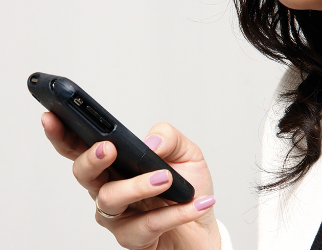
3. Fingers – Remember on mobile and tablets, the finger is the mouse. “Click here” is an outdated term and a lousy call to action. Show your readers the value for tapping – what’s in it for them. Also, fingers take more space for tapping than mouse arrows do for clicking, so make sure the design allows room.
4. Optimized webpages – Don’t stop your optimized marketing at the email. Carry it through to the landing page and the other pages on your website. Otherwise, you’re wasting the open and the tap.